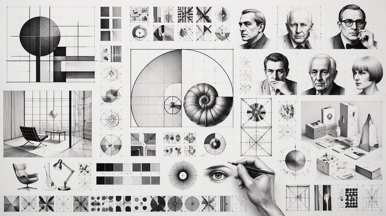
Graphic Design and Core Principles平面设计学及核心原则
Composition / critique / systems构成 / 评估 / 视觉系统Typography / Grid / Color / HierarchyHistory + designers + critique历史 + 设计师 + 评估方法
Graphic design is the discipline of shaping visual communication. It turns information, identity, emotion, function, and culture into visible form through typography, composition, image, color, symbol, layout, sequence, and medium. It is not decoration after the fact; it is the design of how meaning becomes legible, memorable, and usable.
Good graphic design mediates between message and audience. It asks what must be noticed first, what should be trusted, what can be skipped, how a reader moves through a page, and how visual form changes interpretation.
Design exists to carry a message through a chosen medium and context.
A strong design is not one pretty object; it is a reusable logic of spacing, type, color, imagery, and rules.
Forms inherit meanings from art history, technology, politics, commerce, subcultures, and daily life.
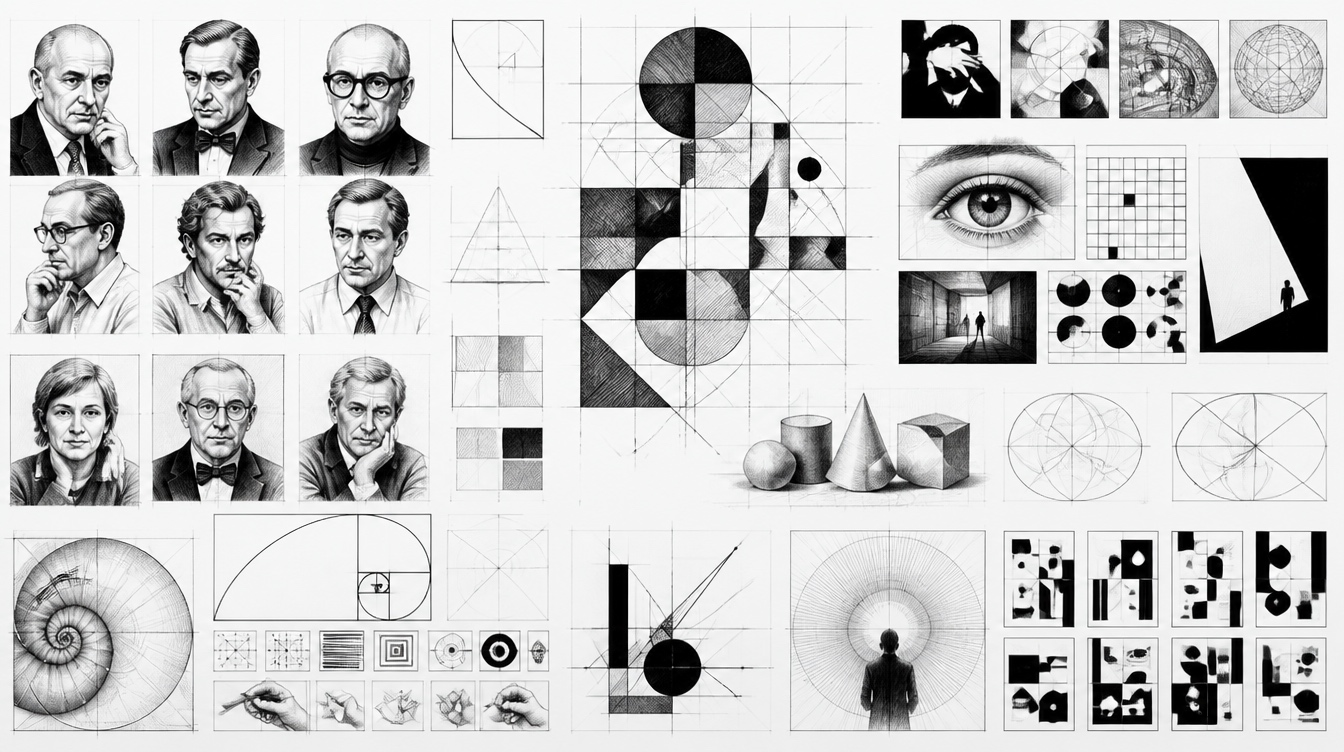
Design begins with marks, writing systems, manuscript layout, seals, movable type, and the discipline of organizing text for memory and reading.
Lithography, mass advertising, newspapers, packaging, and public posters made visual communication faster, louder, and more commercial.
Designers reacted against industrial ugliness and revived craft, ornament, lettering, and integrated page composition.
Modernist design emphasized function, geometry, abstraction, photography, sans-serif type, and design as a social-industrial practice.
Grid systems, asymmetric composition, Helvetica-like neutrality, clarity, and objective information design became dominant professional ideals.
Postwar branding, television, packaging, airline systems, and cultural posters made design central to institutions and consumer memory.
Designers challenged neutrality with expressive typography, collage, fragmentation, desktop publishing, web interfaces, and motion systems.
Today design spans brand systems, UI, variable fonts, generative tools, design tokens, accessibility, sustainability, and participatory critique.
| Principle | Task | What to check | Common failure |
|---|---|---|---|
| Hierarchy | Control order of attention. | Can a viewer identify title, action, and supporting information in seconds? | Everything is equally loud. |
| Contrast | Create difference that matters. | Does size, weight, color, value, or shape separate roles clearly? | Weak contrast produces visual fog. |
| Alignment | Build invisible structure. | Do edges and axes connect elements into a coherent field? | Elements float without relation. |
| Proximity | Show which things belong together. | Are grouped items closer than unrelated items? | The reader must infer structure manually. |
| Repetition | Make systems recognizable. | Do repeated type, spacing, icon, and color rules create rhythm? | Every section invents a new language. |
| Balance | Distribute visual weight. | Does the composition feel stable, tense by intention, or accidentally lopsided? | Weight gathers in one corner without purpose. |
| Grid | Coordinate scale and placement. | Does the layout have columns, margins, baseline rhythm, and breakpoints? | Content cannot scale across formats. |
| Whitespace | Give perception room. | Are important areas allowed to breathe? | Density becomes noise instead of richness. |
| Legibility | Support reading. | Are type size, line length, line height, contrast, and spacing appropriate? | Style wins over comprehension. |
| Unity and variety | Keep coherence without monotony. | Does the system repeat enough to feel stable and vary enough to stay alive? | The work is either chaotic or dead. |
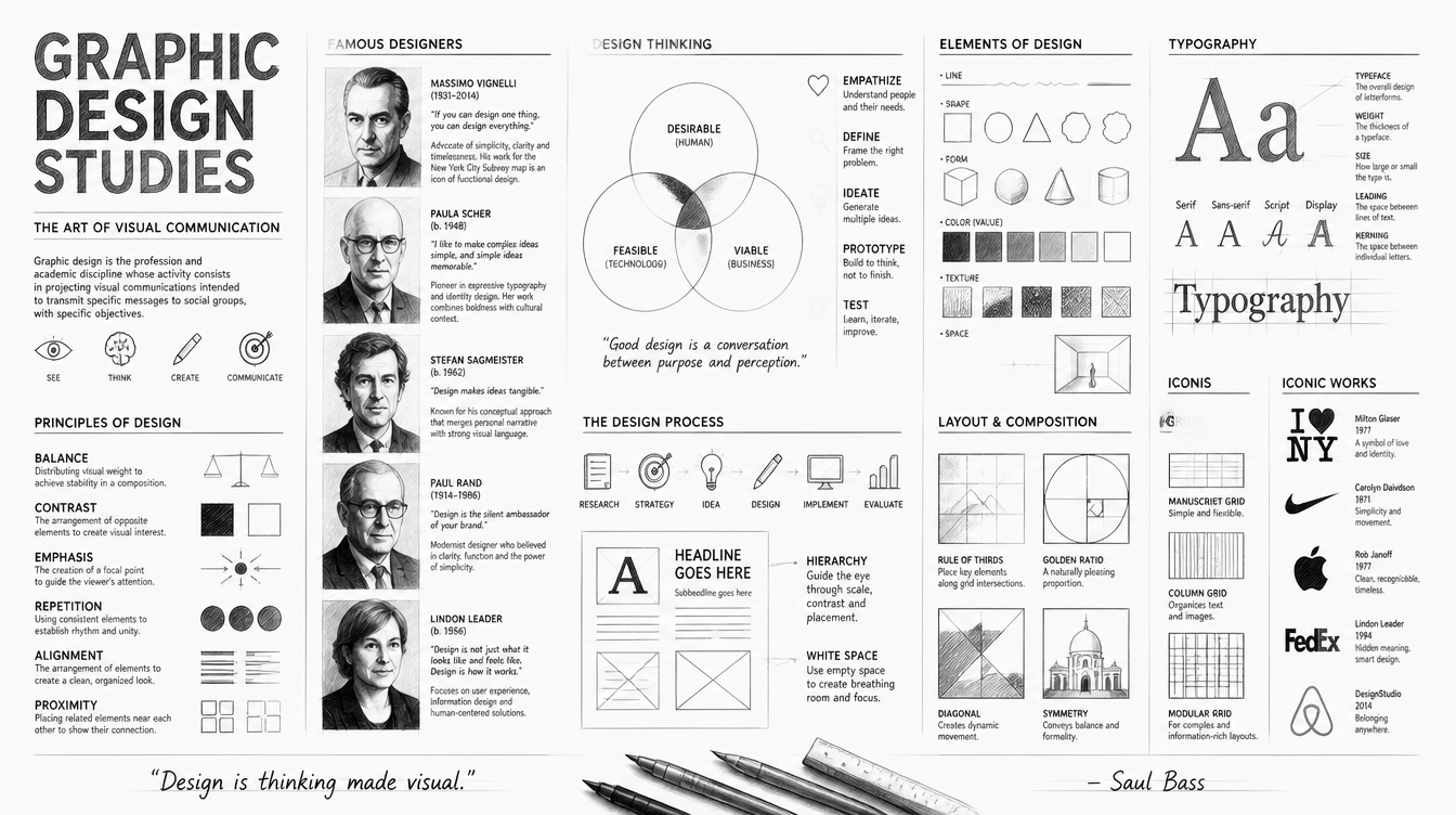
Typography is voice, texture, hierarchy, and reading engineering. Key decisions include type classification, weight, x-height, tracking, line length, line height, optical alignment, fallback fonts, and multilingual support.
Grids are not cages. They are instruments for proportion, sequence, and repeatability: margins, columns, gutters, baseline grids, modular units, and responsive breakpoints.
Color carries attention, emotion, culture, accessibility, and brand memory. A useful palette defines roles: foreground, background, accent, status, surface, border, and muted text.
Similarity, proximity, continuity, closure, figure-ground, and common fate explain why viewers perceive groups, paths, and emphasis before reading details.
A design can be quiet, editorial, brutalist, luxurious, playful, vernacular, systematic, or expressive. The question is whether the stance fits the message and audience.
Print, screen, signage, motion, packaging, and social media each impose different constraints on scale, color, interaction, time, and reading distance.
Arts and Crafts figure who linked design, labor, craft, ornament, and social reform.
Constructivist designer who used geometry, photomontage, and dynamic composition for political and cultural communication.
Advocated modern typography, then later restored respect for classical book design and proportion.
American designer behind major corporate identities, integrating modernism, wit, and memorable simplicity.
Known for film title sequences, posters, and identity work with striking reductive forms.
Swiss designer associated with rigorous grid systems, objective typography, and poster clarity.
Designer of identities, maps, books, furniture, and systems with disciplined modernist restraint.
Designer and illustrator known for expressive posters, editorial work, and the I Love NY mark.
Pentagram partner known for typographic identity systems, cultural branding, and expressive maps.
Early digital design pioneer who embraced pixels, layering, and hybrid image-type compositions.
Designer known for experimental, personal, and emotionally charged visual communication.
Icon designer whose early Macintosh work shaped human-computer visual language.
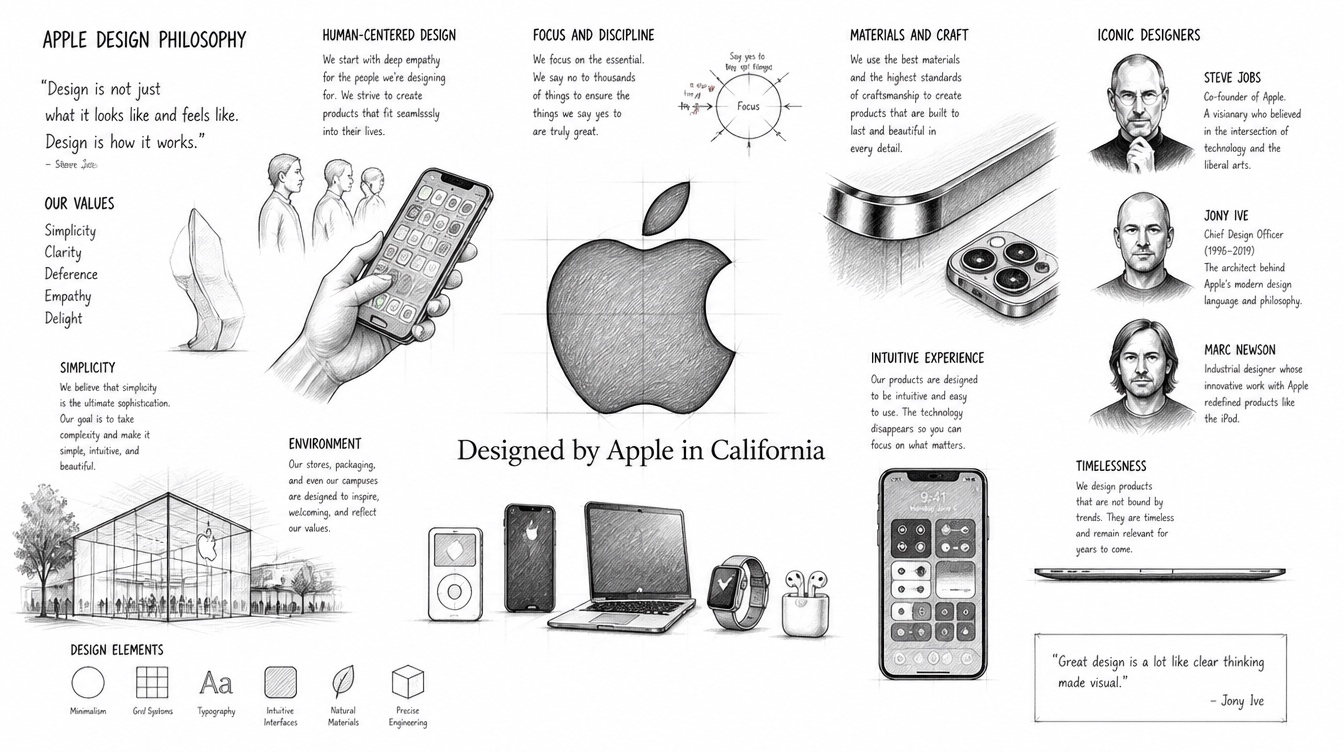
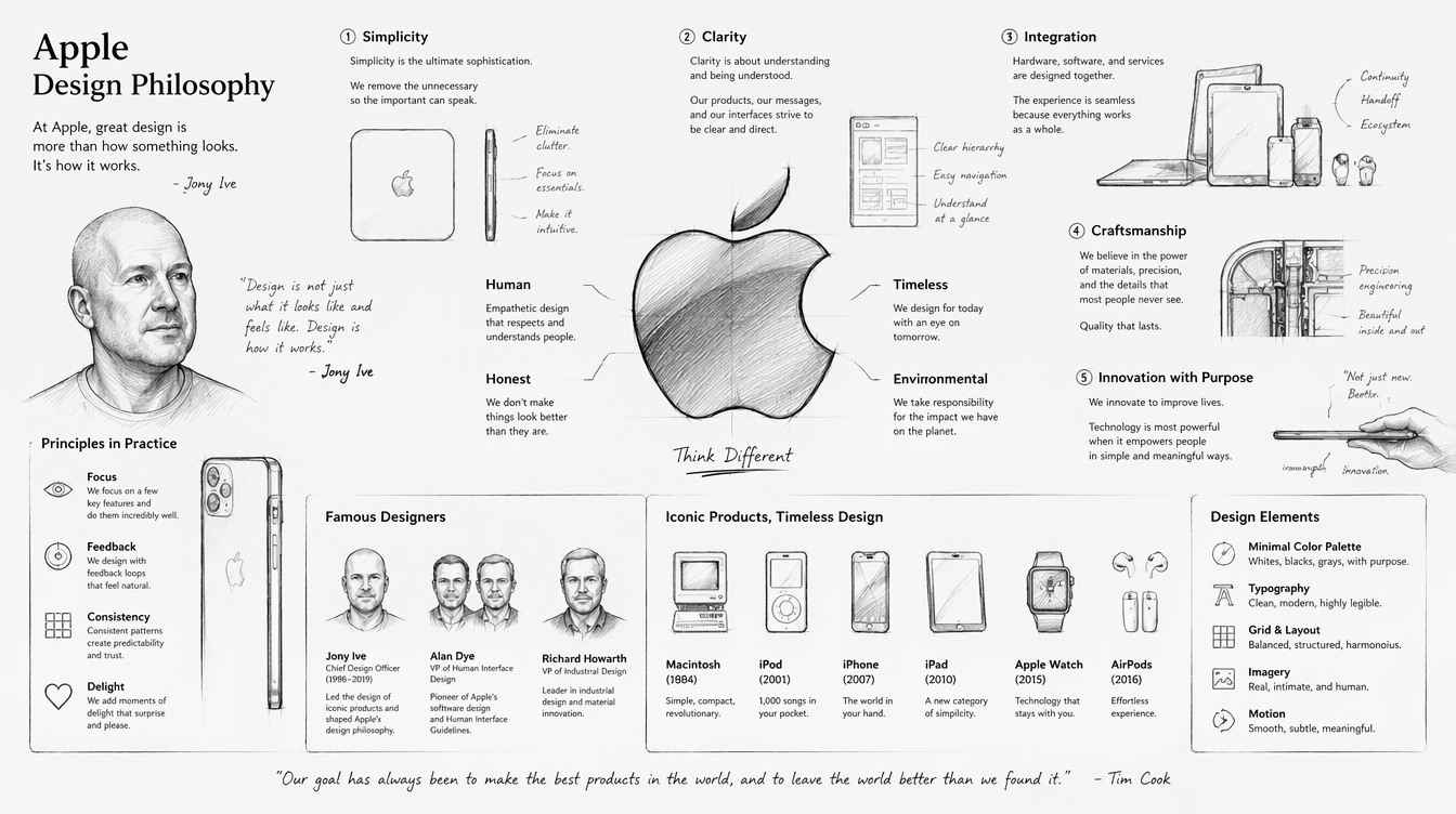
Apple is a useful design case because its visual language connects hardware, software, packaging, retail, advertising, photography, typography, motion, and service experience into one recognizable system. Its minimal surfaces support a broader aim: making technology feel approachable, precise and emotionally desirable.
Remove visual noise, but preserve useful affordances, material cues, hierarchy, and delight.
Product, interface, box, store, keynote, website, and typography are treated as one experience.
Technical complexity is hidden behind direct language, clear icons, calm spacing, and guided interaction.
Apple design often emphasizes machining, glass, aluminum, shadow, tactility, and precise fit.
Apple co-founder who made design a company-level strategy rather than a late styling step. He insisted on end-to-end control of product, interface, retail, and communication.
Former Chief Design Officer whose studio shaped the iMac, iPod, iPhone, iPad, Apple Watch, and many hardware design languages.
Created many early Macintosh icons and interface graphics, making personal computing feel friendly and memorable.
Designer of the Apple logo, one of the most recognized marks in technology and consumer culture.
Define audience, message, constraints, medium, success criteria, tone, and non-negotiables before making forms.
Study references, competitors, cultural codes, production limits, accessibility requirements, and user behavior.
Sketch broadly, prototype quickly, compare alternatives, and keep the best logic rather than the first attractive surface.
Ask what the design makes clear, what it hides, where the eye travels, whether it fits the audience, and whether style serves meaning.
Prepare files, grids, assets, type licenses, color spaces, responsive states, naming rules, exports, and handoff documentation.
Consider accessibility, manipulation, stereotypes, sustainability, privacy, dark patterns, cultural appropriation, and labor behind visual systems.
平面设计学研究视觉传播如何被组织成可读、可信、可记忆、可使用的形式。它通过字体、构图、图像、色彩、符号、版式、序列和媒介,把信息、身份、情绪、功能和文化转化为可见结构。它是“意义如何被看见”的设计,并非事后的装饰。
好的平面设计在信息与受众之间建立清晰关系:什么先被看见,什么应该被信任,什么可以被略过,读者如何移动视线,以及视觉形式如何改变理解。
设计的存在是为了让信息在具体媒介和语境中被传达。
强设计是一套可复用的间距、字体、色彩、图像和规则,并非单个好看的物件。
视觉形式继承艺术史、技术、政治、商业、亚文化和日常生活中的意义。
设计从符号、文字系统、手稿版式、印章、活字印刷和阅读组织开始。
石版印刷、大众广告、报纸、包装和公共海报让视觉传播更快速、更响亮、更商业化。
设计师反思工业化的粗糙,重新强调工艺、装饰、手写字形和整体页面构成。
现代主义强调功能、几何、抽象、摄影、无衬线字体,以及设计作为社会和工业实践。
网格系统、非对称构图、中性字体、清晰性和客观信息设计成为专业理想。
战后品牌、电视、包装、航空系统和文化海报让设计成为机构与消费记忆的核心。
设计师用表现性字体、拼贴、碎片化、桌面出版、网页界面和动态系统挑战中性观念。
今天的设计横跨品牌系统、UI、可变字体、生成式工具、设计 token、无障碍、可持续和参与式评估。
| 原则 | 任务 | 检查问题 | 常见失败 |
|---|---|---|---|
| 视觉层级 | 控制注意力顺序。 | 观者能否在几秒内识别标题、行动点和辅助信息? | 所有内容一样响。 |
| 对比 | 制造有意义的差异。 | 尺寸、字重、色彩、明度或形状是否清楚区分角色? | 弱对比造成视觉雾气。 |
| 对齐 | 建立看不见的结构。 | 边缘和轴线是否把元素连接成一致场域? | 元素像漂浮物一样无关系。 |
| 邻近 | 显示哪些内容属于一组。 | 相关内容是否比无关内容更靠近? | 读者必须自己猜结构。 |
| 重复 | 让系统可识别。 | 字体、间距、图标和色彩规则是否形成节奏? | 每个区块都发明新语言。 |
| 平衡 | 分配视觉重量。 | 构图是稳定、有意紧张,还是无意倾斜? | 重量无目的地堆在一角。 |
| 网格 | 协调尺度与位置。 | 是否有列、边距、基线节奏和断点? | 内容无法跨格式扩展。 |
| 留白 | 给感知留空间。 | 重要区域是否有呼吸感? | 密度变成噪音而不是丰富。 |
| 可读性 | 支持阅读。 | 字号、行长、行高、对比和间距是否合适? | 风格压倒理解。 |
| 统一与变化 | 保持一致但不单调。 | 系统是否既稳定又有活力? | 作品要么混乱,要么僵死。 |
字体是声音、肌理、层级和阅读工程。需要决定的事项包括字体分类、字重、x-height、字距、行长、行高、视觉对齐、备用字体和多语言支持。
网格是比例、序列和可复用性的工具:边距、列、沟槽、基线网格、模块单元和响应式断点,并非笼子。
色彩承载注意力、情绪、文化、无障碍和品牌记忆。有用的色板会定义前景、背景、强调、状态、表面、边框和弱化文本。
相似、邻近、连续、闭合、图底关系和共同命运解释了观者为什么先感知组、路径和强调,再阅读细节。
设计可以安静、编辑化、粗粝、奢华、游戏化、民间化、系统化或表现性。关键是这种立场是否适合信息与受众。
印刷、屏幕、导视、动态、包装和社媒分别对尺度、色彩、交互、时间和阅读距离提出不同约束。
工艺美术运动代表人物,把设计、劳动、工艺、装饰和社会改革联系起来。
构成主义设计师,用几何、摄影蒙太奇和动态构图进行政治与文化传播。
曾倡导现代字体设计,后又重新尊重古典书籍设计和比例。
以电影片头、海报和品牌识别闻名,善用强烈而简化的图形。
瑞士风格代表设计师,强调严谨网格、客观字体和海报清晰性。
早期数字设计先锋,拥抱像素、图层和图文混合构成。
Apple 是一个很适合分析的设计案例,因为它把硬件、软件、包装、零售、广告、摄影、字体、动效和服务体验连接成一个可识别的系统。它的极简表面服务于更大的目标:让技术显得可亲、精确,并具有情感吸引力。
去掉视觉噪音,但保留必要的可用性线索、材质感、层级和愉悦感。
产品、界面、包装、门店、发布会、网站和字体被当成同一个体验来处理。
技术复杂性被直接语言、清晰图标、安静间距和引导式交互隐藏起来。
Apple 设计常强调加工、玻璃、铝、阴影、触感和精确装配。
Apple 联合创始人,把设计提升为公司级战略,而不是最后的外观包装。他强调产品、界面、零售和传播的端到端控制。
前 Apple 首席设计官,其团队塑造了 iMac、iPod、iPhone、iPad、Apple Watch 和多代硬件语言。
在造型之前定义受众、信息、限制、媒介、成功标准、语气和不可妥协项。
研究参考、竞品、文化代码、生产限制、无障碍要求和用户行为。
广泛草图、快速原型、比较方案,保留最好的逻辑,而不是第一个好看的表面。
询问设计让什么更清楚、隐藏了什么、视线如何移动、是否适合受众、风格是否服务意义。
准备文件、网格、素材、字体授权、色彩空间、响应状态、命名规则、导出和交付说明。
考虑无障碍、操纵、刻板印象、可持续、隐私、暗黑模式、文化挪用和视觉系统背后的劳动。
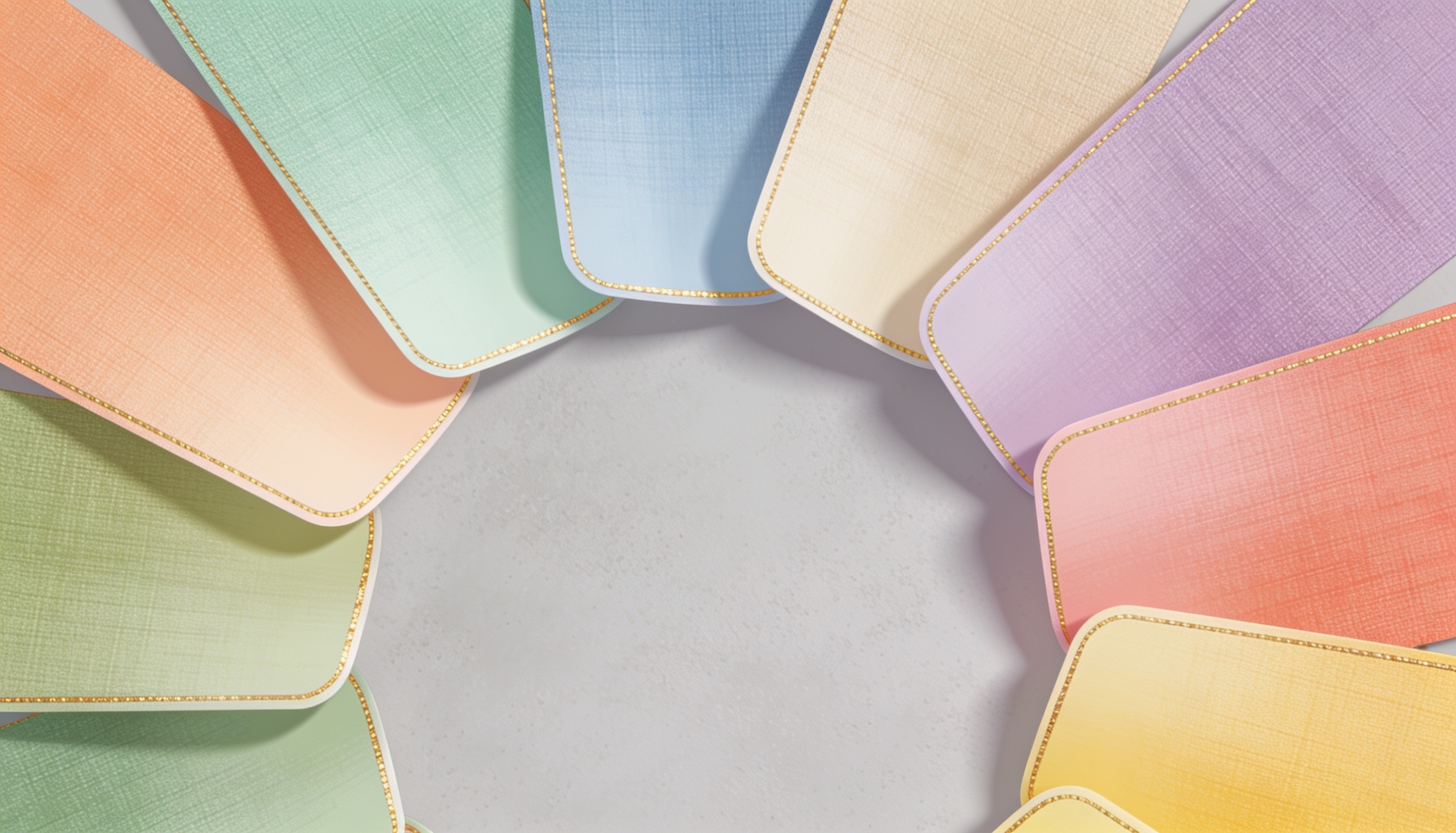
This atlas collects common graphic-design colors as visible chips with English names, Chinese names, and hex values. Names vary by culture and brand system, so the hex code is the practical production anchor.这个色彩库把常见平面设计颜色做成可见色块,并列出英文名、中文名和 HEX 十六进制码。颜色名称会随文化和品牌系统变化,因此实际生产中应以 HEX 码作为锚点。
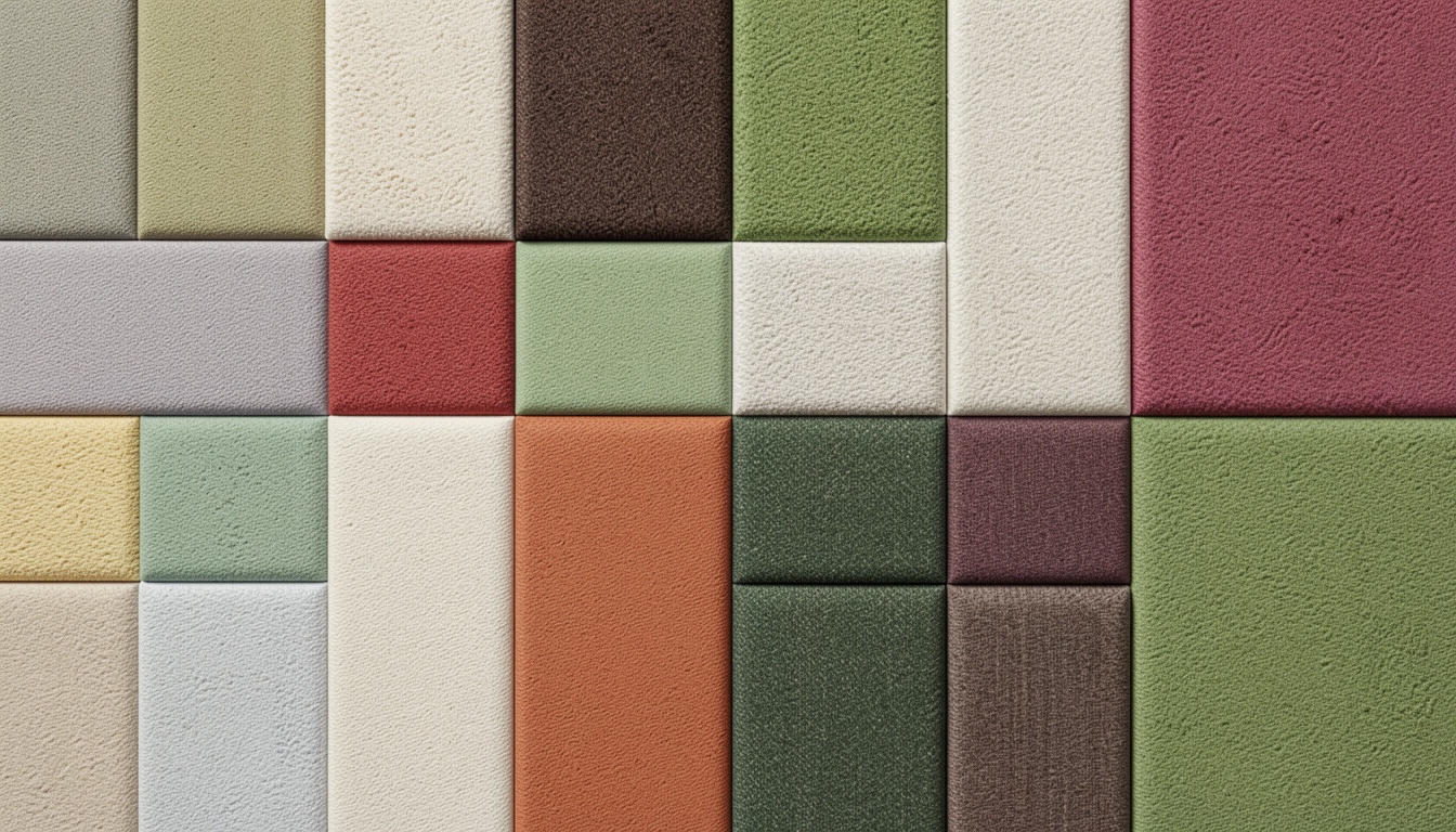
Palette design is role design: background, surface, text, accent, support, warning, and muted states. The combinations below are shown directly as webpage color boards with hex codes.配色需要为背景、表面、文字、辅助、警示和弱化状态分配角色,不能只挑几个好看的颜色。下面的常见组合都以网页色板直接显示,并列出 HEX 码。
Reports, portfolios, academic pages.
#FFFFFF#111827#D1D5DB#2563EB#F59E0BMuseums, craft brands, cultural publications.
#F7F3EA#2F2A24#B79C64#C45A3A#6E7F68SaaS dashboards, app visuals, launch pages.
#0B1020#F8FAFC#38BDF8#A78BFA#22C55ELifestyle, beauty, wellness, essays.
#FCE7F3#881337#FB7185#FDE68A#FFFFFFPosters, education, geometric layouts.
#111111#F5F5F0#E11D48#FACC15#2563EBInformation design, grids, typography.
#E5E7EB#111827#6B7280#9CA3AF#F9FAFBFood, agriculture, handmade packaging.
#FEF3C7#78350F#D97706#059669#1F2937Healthcare, climate, education technology.
#ECFEFF#164E63#06B6D4#14B8A6#F97316Portfolios, events, expressive identity.
#FAF5FF#3B0764#9333EA#F0ABFC#FDE68AMusic posters, cafes, community campaigns.
#FFF7ED#7C2D12#EA580C#FDBA74#0F172AEnvironmental reports, nature brands.
#F0FDF4#14532D#22C55E#A3E635#334155Charts, articles, civic information.
#F8FAFC#0F172A#64748B#CBD5E1#DC2626Premium packaging and hospitality.
#FFFBEB#422006#B45309#F59E0B#A16207Fashion campaigns and beauty packaging.
#FDF2F8#831843#DB2777#F9A8D4#4A044EBusiness decks, finance, trustworthy systems.
#EFF6FF#1E3A8A#3B82F6#93C5FD#F97316Music, youth culture, immediate impact.
#111827#F9FAFB#F43F5E#22D3EE#A3E635Editorial, interiors, calm product pages.
#FAFAF9#1C1917#78716C#D6D3D1#A8A29ESoftware, documentation, control surfaces.
#F8FAFC#020617#334155#94A3B8#E2E8F0Motion, tech events, nightlife posters.
#0F172A#E0F2FE#38BDF8#818CF8#F472B6Warnings, campaigns, high-impact posters.
#FEF2F2#7F1D1D#DC2626#FCA5A5#111827Luxury beauty, magazines, invitation systems.
#FFF1F2#4C0519#BE123C#FDA4AF#FBBF24Food festivals, seasonal campaigns, packaging.
#FFFBEB#451A03#92400E#FCD34D#65A30DHealth apps, clinics, wellness services.
#F0FDFA#134E4A#0D9488#5EEAD4#F97316Learning platforms, schools, public knowledge.
#EFF6FF#172554#1D4ED8#60A5FA#FACC15AI tools, automation, model dashboards.
#F5F3FF#2E1065#7C3AED#C4B5FD#34D399Finance dashboards, payment products, trust.
#ECFDF5#064E3B#10B981#A7F3D0#0F172AEvents, posters, pop-up stores.
#FDF4FF#581C87#C026D3#F0ABFC#FDE047Nature, gardens, botanical packaging.
#F7FEE7#365314#65A30D#BEF264#A16207Cafes, roasters, warm menus.
#FFF7ED#431407#C2410C#FED7AA#1E293BBooks, long essays, literary pages.
#F8FAFC#1E293B#475569#F8F4E3#B4530970s posters, music, vintage packaging.
#FFEDD5#9A3412#EA580C#FDBA74#4D7C0FTravel, spa, nonprofit, information design.
#F0F9FF#0C4A6E#0284C7#7DD3FC#E0F2FESummer campaigns, tourism, festival graphics.
#FEFCE8#713F12#EAB308#FEF08A#7C2D12Data products, alerts, monitoring systems.
#F1F5F9#0F172A#16A34A#EAB308#DC2626Premium events, nightlife, high-fashion visuals.
#0A0A0A#F5F5F5#D4AF37#8B5CF6#EF4444Mobile interfaces, system controls, app states.
#FFFFFF#000000#FF3B30#34C759#007AFFMost design tools describe color through several layers at once: numeric models, color spaces, opacity, blending, print production, accessibility, and reusable style systems. These elements appear across Photoshop, Illustrator, InDesign, Figma, Sketch, Affinity, Canva, web design tools, and design-token workflows.大多数设计软件是同时涉及数值模型、色彩空间、不透明度、混合、印刷生产、无障碍和可复用样式系统,并非只用一个“颜色值”描述颜色。这些元素常见于 Photoshop、Illustrator、InDesign、Figma、Sketch、Affinity、Canva、网页设计工具和 design token 工作流。
| Element | 中文 | What it controls | Typical notation |
|---|---|---|---|
| Hex color | 十六进制颜色 | Web and UI color value, often based on sRGB. | #2563EB |
| RGB | 红绿蓝 | Additive screen color channels. | rgb(37, 99, 235) |
| RGBA / Alpha | 透明通道 | RGB plus opacity for overlays and UI states. | rgba(37, 99, 235, .72) |
| HSL | 色相 / 饱和度 / 亮度 | Designer-friendly hue rotation and tonal adjustment. | hsl(221 83% 53%) |
| HSB / HSV | 色相 / 饱和度 / 明度 | Common picker model in illustration and image tools. | hsb(221, 84%, 92%) |
| CMYK | 青 / 品红 / 黄 / 黑 | Subtractive print color separations. | cmyk(84, 58, 0, 8) |
| Lab | Lab 色彩 | Device-independent perceptual color model. | L* a* b* |
| LCH | 亮度 / 彩度 / 色相 | Perceptual cylindrical color model. | lch(55% 72 285) |
| OKLCH | OKLCH 感知色彩 | Modern perceptual color useful for UI scales. | oklch(60% .18 260) |
| Grayscale | 灰度 | Single-channel value for neutral systems and print. | K 60% / #666666 |
| Tint | 加白 / 浅色阶 | Lighter version of a base color. | Blue 20% |
| Shade | 加黑 / 深色阶 | Darker version of a base color. | Blue 900 |
| Tone | 加灰 / 降彩度 | Muted version of a color for editorial balance. | Muted teal |
| Opacity | 不透明度 | Transparency of a layer, object, or fill. | 72% |
| Blend mode | 混合模式 | How a color combines with colors below it. | multiply / screen / overlay |
| Gradient | 渐变 | Color interpolation across stops, angle, and position. | linear-gradient() |
| Swatch | 色板样本 | Saved reusable color in a document or library. | Brand / Primary |
| Global color | 全局颜色 | Linked color that updates all instances. | Illustrator global swatch |
| Color style | 颜色样式 | Named reusable color role in UI tools. | Surface / Accent |
| Design token | 设计 token | System-level variable connecting design and code. | color.bg.primary |
| Spot color | 专色 | Premixed ink used for brand or print precision. | Pantone spot |
| Process color | 四色印刷色 | Color reproduced with CMYK process inks. | Process CMYK |
| Pantone | 潘通色 | Standardized commercial color matching system. | PMS 286 C |
| ICC profile | ICC 色彩配置文件 | Device and output color management. | sRGB / FOGRA / GRACoL |
| sRGB | 标准 RGB | Default web color space. | sRGB IEC61966 |
| Display P3 | Display P3 广色域 | Wide-gamut screen color for modern devices. | color(display-p3 ...) |
| Gamut | 色域 | Range of colors a device or process can reproduce. | in-gamut / out-of-gamut |
| Overprint | 叠印 | Print behavior where inks print over each other. | overprint fill |
| Knockout | 镂空 / 挖空 | Print behavior where lower color is removed. | knockout text |
| Rich black | 丰富黑 | CMYK black mixed with other inks for deeper print black. | C60 M40 Y40 K100 |
| Registration color | 套准色 | Print mark color appearing on every plate. | Registration |
| Paper / substrate | 纸张 / 承印物 | Material changes perceived color and ink behavior. | coated / uncoated |
| Contrast ratio | 对比度 | Accessibility relation between text and background. | 4.5:1 / 7:1 |
| Semantic color | 语义颜色 | Meaning-based UI role such as success or danger. | success / warning / error |